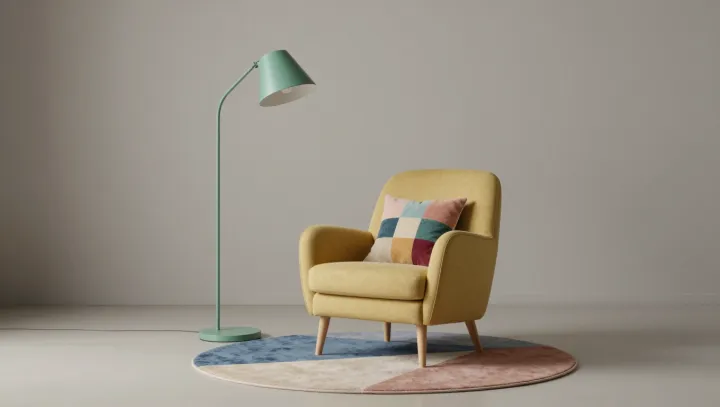
A bright floor lamp can do more for a reading corner than a wall drenched in color. Against a neutral backdrop, its saturated shade gains definition, while a rounded armchair and geometric textiles have room to register as distinct shapes. Restraint makes color louder. The result feels composed, not timid.
Repetition is the quiet trick. A hue picked up from the lamp in a cushion or a line of a patterned throw gives the eye a path through the arrangement, rather than leaving one intense object stranded in a field of beige. That visual connection need not be exact: related shades can belong together without looking mechanically matched. Scale matters, too. A small geometric print beside a larger, simpler shape keeps the textiles from competing with the chair's curved silhouette. Too many unrelated colors, by contrast, can make even a modest collection of accents feel busy.
Comfort deserves equal billing. Place the lamp where its light reaches the page without shining directly into your eyes, and choose a chair that supports the way you actually sit; a handsome corner that makes reading awkward will soon become furniture to look at. Keep the largest pieces calm, then try color in a cushion, throw or lampshade before committing to anything harder to change. You can swap those accents as your taste shifts, while the room holds its shape. The smallest decisions often carry the most character. Would you let the lamp lead, or give that job to the textiles?